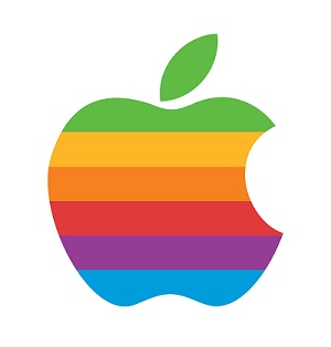
Who doesn't know about Apple? We are not here talking about the apple fruit but about the company which is counted among the best brands in the world in today's time. Everyone is crazy about Apple's products and somewhere in everyone's heart, there is a strong urge to buy its products. Now the company is special, so obviously its logo would also be special as catchy it looks. But have you ever noticed why the Apple logo is always represented as half-eaten? It could have been a full apple, but why did they only choose the half-eaten apple as their logo?
So it's a story that Apple's byte(bite) was taken from what we technically call, bits or bytes, but that's actually wrong and just a rumor. The real reason is that Steve Jobs wanted a logo for their first Apple products and he appointed a new designer at that time, a logo designer named Rob Janoff. It is a different matter that now he is famous for the creation of the Apple logo but during that time he was a newcomer.
But if we talk about the early days of the Apple, there was a logo like the one you see in the picture above, which was depicting the whole story that Newton is sitting under the apple tree and an apple is ready to fall on his head. But it didn't look like a logo at all and was very complex to understand.
On the other side, other companies, such as IBM and other technology companies, all had the company name in the text on their logos. But Apple did not make its logo in text, instead, they depicted it as a real apple, but the problem was that this apple fruit was matching with many other fruits, such as Peach and Orange. Everyone felt that people should not get confused by looking at the apple, that is, it should not look like the rest of the fruits, so they made a bite on it and left it half-eaten.
After so many efforts, it was able to make a huge difference from the other fruits and started looking like an apple, giving the real feeling of an apple. Then they added seven colors to it, which was the earlier logo, as Apple's screen at that time was the first to support multiple colors, and this is how Apple's historical logo became.
 |
The 1977 Rob Janoff's “rainbow” version of the Apple Logo.


0 comments:
Post a Comment